
I want to DIY my website, but I’m not creative!! Don’t worry, you don’t need to be creative to build your own website. You just need to be able to figure out what layout to use with what information. Once you have the right layout,
Think of it like if you were trying to display a movie in a 1980s photo album. That’s not the right format, and no amount of creativity is going to fix that. Similarly, if you try to put 10 paragraphs of text in a huge block on a website, it’s likely not going to look good. But if you break it up and choose layouts that fit the content, it’ll come together much more easily.
(For 10 paragraphs, I would break it up into 5 groups of two. Use a two column layout with an image in one column and the text in the other. For bonus points, alternate the images, so the first one is in the left column and the second one is in the right column. Look at you, Fancy!!)
Pssst… If you don’t know what content to put on your website, check out this article on some of the sections you might want to add to get your site started.
Some DIY website layouts you can use:
>Image/ text.
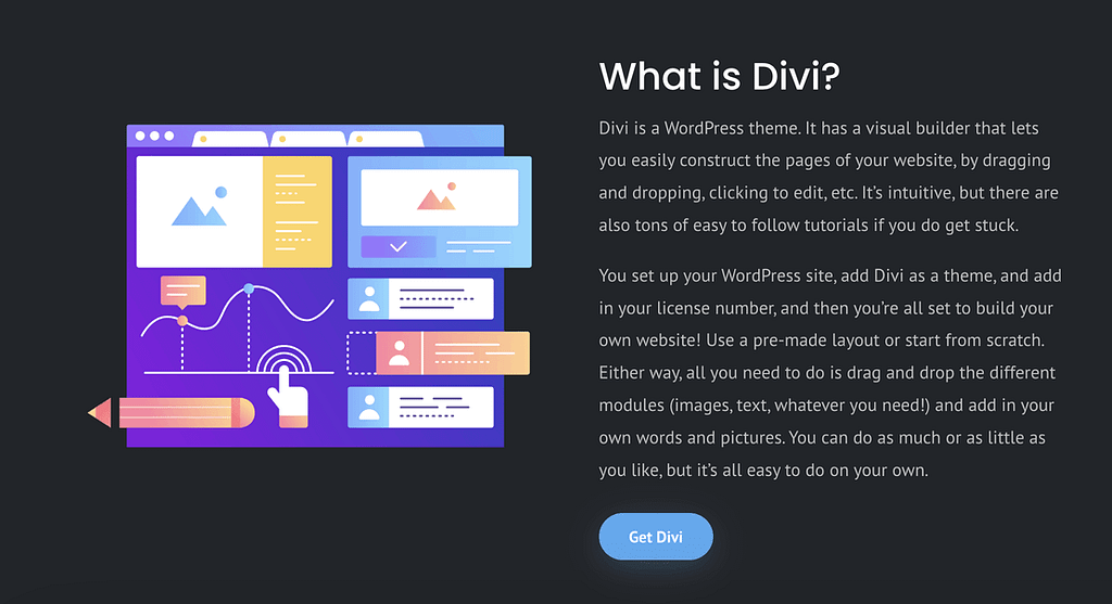
This is the go-to classic. When you don’t know what to do, do this. Jazz it up by alternating the images in the left/ right columns. This works especially well if you have an odd number of rows. Or, you can be more fancy by switching it from two even columns to 1/3 and 2/3 width. Divi gives you a bunch of different column options, from halves through sixths. So, even if you only ever use this one layout, you still have lots of space to be creative!
>Header & Two Column Row
This is a variation on the Image/ Text two-column layout above. You can create this layout by using two separate rows. The first row is just one column, so it takes up the whole width of the content. The second row is two halves. This one works really well for adding in a heading above some more detailed content.
Sometimes, I also add another row beneath. I make that third row one column as well (like the heading) and then add a call to action button. You can put the button in the column with the text, if you prefer. But sometimes it makes more sense to make the button larger and give it more space, to better grab people’s attention.
>3 blurbs:
‘Blurbs’ are a kind of Divi module that has an icon and then text all together. I use these often for a highlight section or to show off different services. You can add an image or icon and then combine it with text. I really like these because I think the images grab the reader’s attention, and then the smaller text is a space for more details.

>Image or pattern behind, text on top.
I love this one, as you can see from my websites. I think the images just act like a gorgeous wallpaper for your website and make it feel warm and welcoming. Bonus points for adding a button. Big bonus points if you can find and click the parallax button – it’ll rock your world. If you can’t read the text well enough, add a background color to the text or to the row that has the text in it. This works especially well at the top and bottom of a page.

>FAQs
I almost always use an accordion module for this. In Divi, the accordion module shows one set of text when each That way, all the questions show, bar is closed, and then opens up to reveal more text when the reader clicks on the toggle. So, this allows the reader to easily skim through only the questions (and not all the text)and then click on only the questions they want to read the answers to. Plus, the animation is really engaging and having the answers hidden at first keeps people from being overwhelmed by a wall of text.
If you have too many FAQs, you can always expand this to its own page, as well. I usually start out with just a small FAQ on the home page and then copy/ paste it to its own page as the site grows. Then, you can keep only the most common ones on the home page.

>alternating testimonials:
I use 1/5 and 4/5 sizes for this and just alternate the rows. If you don’t have pictures of the people who left you reviews, you can just add in graphics of people (or dogs!). I like this one because it’s interesting visually, but also makes the testimonials easy to read. The formatting is pretty much already done for you, and it’s easy to change the colors of the quote icon (or remove it all together).

>Blog Grid:
This one is super easy in Divi. Just add a blog grid and choose which category of posts you want to show (or all of them!). You can choose the different layouts and how many posts you’d like to show up. The module automatically pulls all the blog posts from the category you choose. Plus, if you want to have a whole page with just excerpts from all your blog articles, I talk about how to do that in this article. With very little styling, you’ll have something that looks like this:

The Divi theme has literally thousands of pre-made layouts for you to choose from! You can choose a whole page layout, a whole website layout, or just choose the section or even module you like and go from there. The ones I’ve shared here are some of the most common layouts I use all the time when building websites. There are tons of ideas out there, but hopefully, these will help keep you from getting overwhelmed!


